
How to Choose Interior Paint Colors That Fit Your Home’s Style
Feeling Overwhelmed by Paint Choices? You’re Not Alone
If you’re wondering how to choose interior paint colors that complement your space, you’re not alone. With endless shades, finishes, and combinations to choose from, it’s no surprise that picking the perfect palette can feel a little overwhelming.
Color plays a huge role in how your home feels—from the mood it sets to how cohesive your space looks overall. But choosing the right color isn’t just about following trends or grabbing a swatch that looks good under store lights. It’s about finding colors that reflect your personal style, work with your space, and enhance your everyday living.
In this blog, we’ll walk through how to choose interior paint colors to:
- Match color choices to your home’s style and lighting
- Use color psychology to guide decisions for each room
- Avoid the most common color selection mistakes
- Understand the value of professional input through an interior color consultation
Let’s break it down and take the stress out of choosing the right color.
Start with the Style of Your Home
Choosing the right interior paint starts with understanding the space you’re working with. Your home’s architecture, layout, and built-in features all play a role in selecting colors that feel intentional and cohesive—not random or out of place.
Match Colors to Architecture and Interior Elements
Your home’s style should help steer your color decisions. Certain color palettes naturally complement specific design aesthetics:
- Modern or minimalist homes pair well with crisp whites, soft grays, and bold accent walls for contrast
- Farmhouse-style spaces lean toward warm whites, sage greens, and muted earth tones
- Traditional homes often look best with rich colors like navy, deep taupe, or burgundy, balanced by classic neutrals
- Eclectic or transitional spaces can handle playful hues, as long as they’re balanced by neutral backdrops
Also, take into account fixed elements such as:
- Flooring (wood tones, tiles, carpeting)
- Cabinets and countertops
- Trim and molding color
- Existing furniture or decor you plan to keep
These elements act as a baseline color palette that new paint should complement, not clash with.
Understand Your Home’s Natural Light and Layout
Lighting has a major impact on how colors appear in your space.
- North-facing rooms can make colors look cooler—choose warmer tones to balance
- South-facing rooms get consistent light and are ideal for bold or deep shades
- East-facing rooms tend to glow in the morning but cool off in the afternoon
- West-facing rooms get warmer, golden light later in the day
Also, consider whether your space is open concept or room-by-room. In open layouts, flowing, harmonious colors work best. For separate rooms, you have more freedom to experiment, but transition zones still need to feel natural.
Color Psychology and Room Functionality
Color doesn’t just fill a wall—it sets the tone for how a room feels and functions. Whether you’re designing a calming bedroom retreat or a focused home office, the psychological impact of color should be part of your decision-making process.
How Color Influences Mood and Behavior
Different hues naturally evoke different emotional responses. That’s why one shade might feel serene in a bedroom but overstimulating in a workspace.
- Cool tones like blues, greens, and soft grays promote relaxation—great for bedrooms and bathrooms.
- Warm colors like yellows, reds, and oranges can feel energizing and sociable, ideal for kitchens or dining areas.
- Neutrals such as whites, beiges, and taupes create balance and are perfect for open-concept living spaces.
- Deep, rich colors add sophistication but can make small rooms feel closed in if overused.
The key is balance. One bold feature wall can be exciting, but too many bold choices in one space can lead to visual fatigue.
What Works Best Where?
Here are a few popular pairings based on room functionality and trends in best paint colors for home interiors:
- Living Rooms: Warm neutrals, greige, or soft blue-grays for comfort and flexibility
- Bedrooms: Dusty blues, sage greens, or mauves for calm and restfulness
- Home Offices: Muted green, navy, or charcoal to encourage focus without feeling sterile
- Bathrooms: Cool pastels or clean white tones to evoke cleanliness and calm
- Kitchens: Soft whites, pale greens, or warm grays to balance energy and warmth
Common Mistakes to Avoid When Choosing Interior Paint Colors
Even with the best intentions, it’s easy to fall into a few color selection traps. Fortunately, knowing what not to do is just as important as knowing what to look for. Here are some of the most common missteps homeowners make when choosing paint—and how to avoid them.
Choosing Without Testing
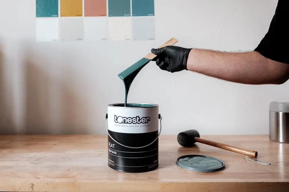
That paint chip might look perfect under store lighting, but it could appear completely different on your wall.
- Colors shift based on lighting, surface texture, and surrounding decor
- Skipping swatch tests often leads to regret (and costly repaints)
- Always sample a few shades directly on your wall before committing
Ignoring Undertones and Lighting
Not all whites are the same. In fact, not all grays, blues, or beiges are either.
- Undertones (cool, warm, green, purple, etc.) can clash with flooring, trim, or furniture.
- Poor lighting can make beautiful colors look dull or mismatched
- Work with your home’s unique lighting conditions, not against them
Overlooking Transitions Between Connected Spaces
This is a big one in open-concept homes.
- If colors don’t flow naturally from one space to the next, it can feel disjointed.
- Avoid sudden or harsh shifts in hue unless intentionally framing a space
- Think of your paint palette as a story that unfolds throughout the home
Following Trends Without Considering Your Home’s Personality
Trendy doesn’t always equal timeless, or right for your home.
- Just because a color is hot on Instagram doesn’t mean it suits your space
- Style alignment matters more than social media inspiration
- Choose colors that support the character of your home, not fight it
Why a Professional Color Consultation Can Make All the Difference
With so many factors influencing paint selection—style, lighting, mood, and flow—it’s no surprise that many homeowners feel stuck. That’s where professional paint color help can truly shine in guiding you on how to choose interior paint colors that go perfectly well with your home.
An expert doesn’t just help you pick a color—they guide you through a thoughtful, personalized process that ensures the final result feels cohesive, intentional, and beautiful.
Personalized Guidance from Experts
A professional color consultant looks at your home with both an artistic and a practical lens.
- They assess your architecture, furnishings, lighting, and personal taste
- Offer expert insight on trends versus timeless choices
- Help you avoid color overwhelm by narrowing down options that truly work
- Ensure that every room feels connected while serving its unique purpose
With years of experience and a trained eye, they’ll make the decision-making process not only easier but far more successful.
The Confidence of Seeing Before You Commit
No more guesswork or paint chip roulette. A professional helps you visualize the end result.
- You’ll receive physical swatches, digital mockups, or curated mood boards
- Some services even test sample sections on your actual walls
- Strategic color planning ensures each room flows seamlessly into the next
Ready to feel confident about your choices? Our team offers expert recommendations tailored to your home’s style, lighting, and lifestyle.
Schedule an interior color consultation.
